When a financial app creates doubt, users don't retry. They leave.
I redesigned the funding and sending flows for users aged 40–65 encountering crypto for the first time. For that user, clarity and reassurance aren't nice-to-haves. They are the product.
Role:
Scope:
Context:

CONTEXT
First designer in six years. Starting from nothing.
I was the first designer in ByteWallet's six-year history. There was no system, no flows, no visual identity. What existed was a template-based product built without a design perspective. I inherited real users, real money moving through a broken interface, and no foundation to build on.
THE PROBLEM
Confusion in a financial app doesn't just frustrate. It costs.
Our core user was not a crypto trader. They were between 40 and 65, arriving through ATM placements across the US or Facebook ads, many using crypto for the first time. Four failure points kept surfacing.
SUPPORT TICKET


“The 3D models David created for our product scanner have been a game changer. They showcase our technology perfectly and integrate seamlessly with our GIB displays at Walmart, making it easier for our teams to demonstrate and for clients to understand the value we bring.”
Jason Broom — CEO of IKEA
DESIGN APPROACH
Audit first. Design where the friction actually was.
Before touching any UI I audited the existing flows to identify exactly where users were carrying cognitive load the product should have been carrying. The goal wasn't aesthetic improvement — it was functional clarity at each decision point.
The redesign had real constraints. Financial compliance required confirmation steps at fixed points that couldn't be removed or reordered. Legacy systems meant fee data couldn't surface dynamically — fee disclosure had to happen at the review screen rather than updating live as users typed. Every constraint shaped a decision.
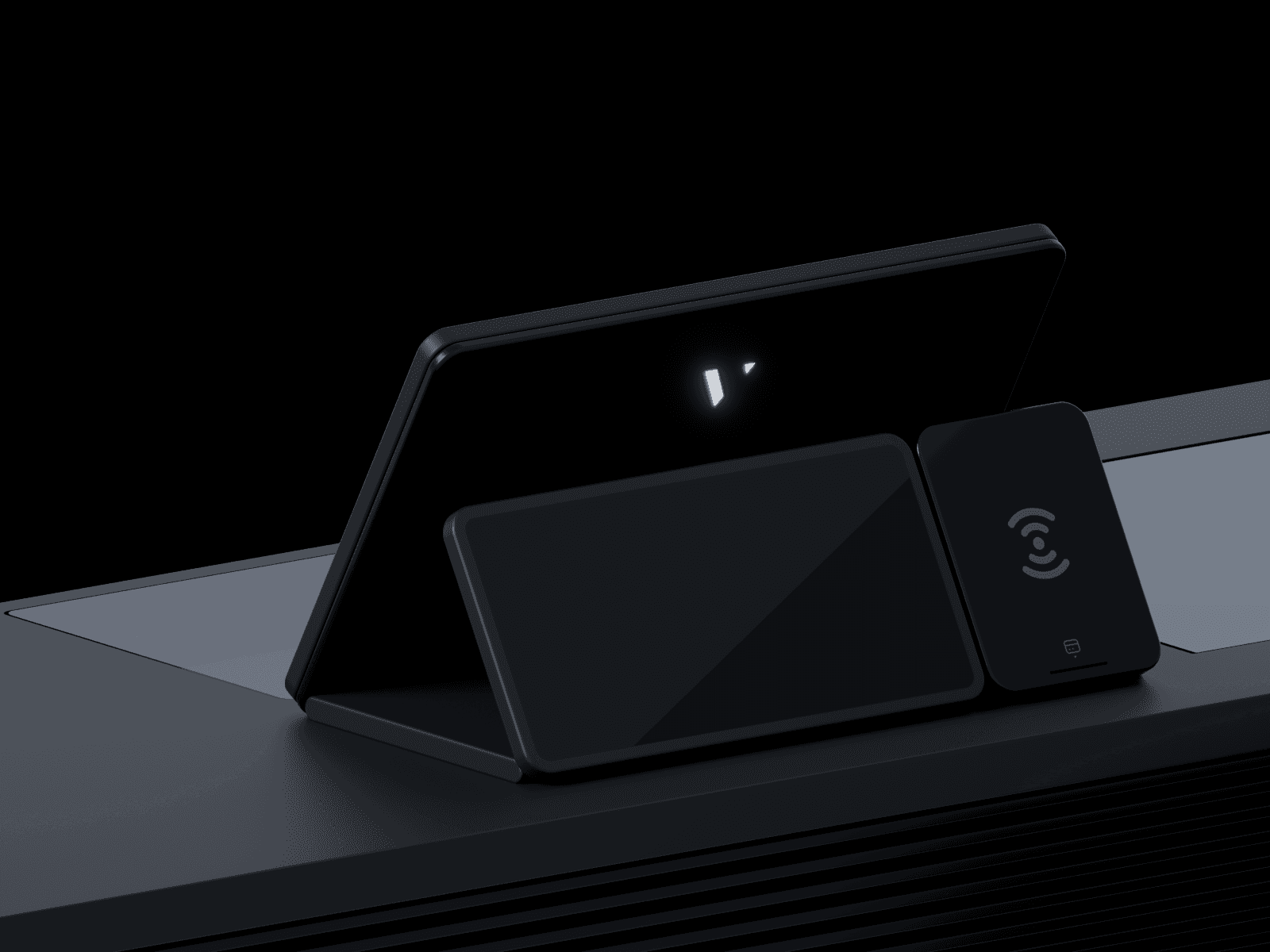
The 3D work not only improved the company’s product presentations but also supported the efficient deployment of the scanners in Walmart, aligning with the retailer’s focus on innovation and efficiency.
The company needed highly detailed 3D models to accurately represent the scanners, showcase their features, and integrate seamlessly with the GIB display system in Walmart stores. The models had to be functional for marketing, demonstration, and training purposes.
“The 3D models David created for our product scanner have been a game changer. They showcase our technology perfectly and integrate seamlessly with our GIB displays at Walmart, making it easier for our teams to demonstrate and for clients to understand the value we bring.”
Jason Broom — CEO of IKEA
The 3D work not only improved the company’s product presentations but also supported the efficient deployment of the scanners in Walmart, aligning with the retailer’s focus on innovation and efficiency.

